Designed a brand to unify Intermountain Health physical and digital experiences
Background
Intermountain Health is a national hospital providing care to many in the Intermountain West. Our team was tasked to unify Intermountain Health and SCL Health brands and combine existing services and products under Intermountain Health. Our main objective was to create a continuity of experience that patients trusted and could identify as Intermountain.
Design System • Branding • Accessibility Design
Project Details
May 2023 - July 2023
UX Designer
3 UX Designers,
3 Project Managers,
3 Buisness Analysts
18 engineers
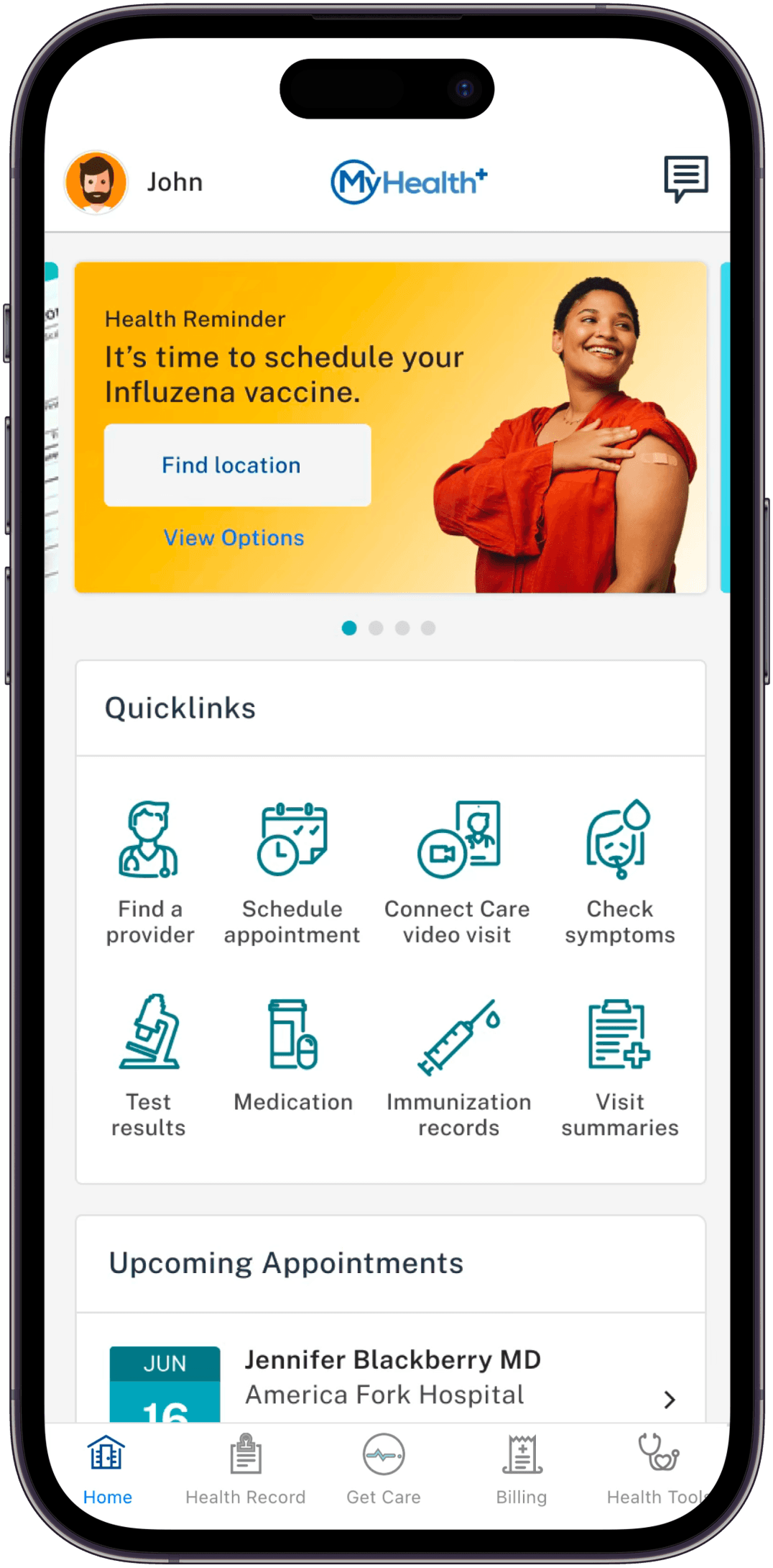
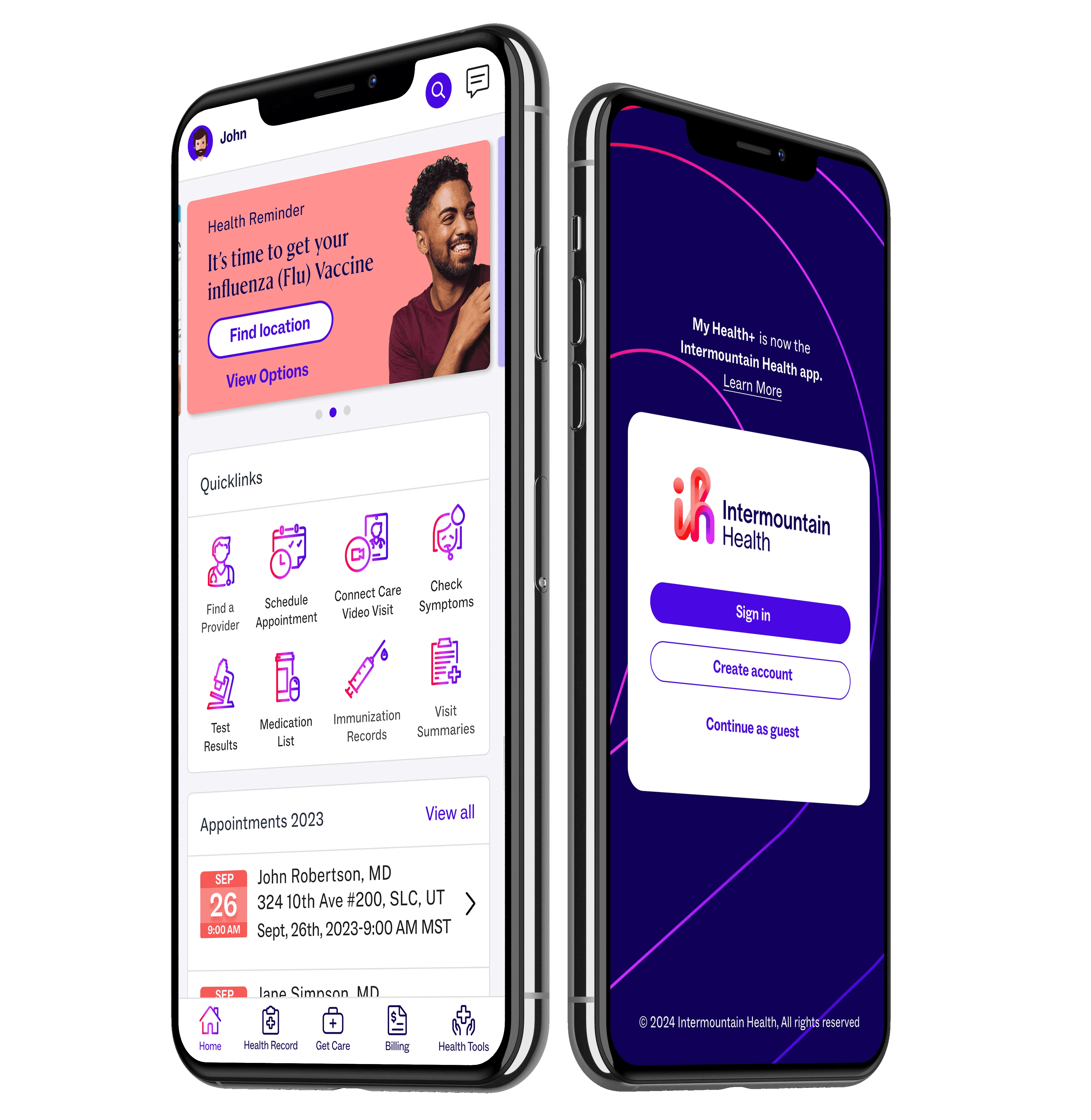
MyHealth+ App for Intermountain Health in 2022
How might we create a new brand identity and develop a scalable, cohesive design system?
We launched our rebrand within 2 months that contains branding guidelines covering digital and physical experiences and a new design system.
By ensuring branding assets were accessible for digital and physical experiences, we created a consistent, unified and reliable brand identity for a hospital and it's patients continuing to know Intermountain's commitment to innovate on providing healthcare to all.


The Process
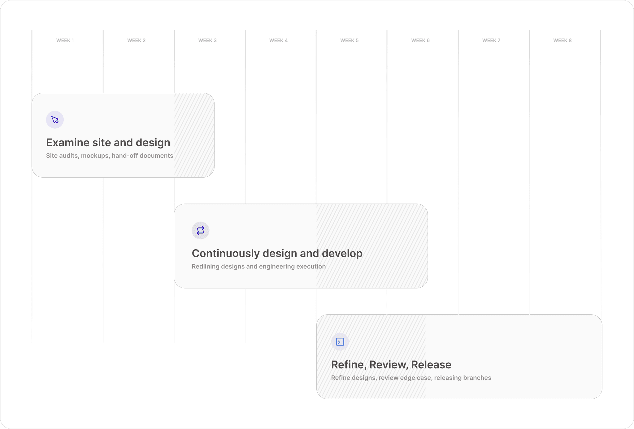
Strategy Timeline
Our beginning strategy was based on phasing the release of branding within areas of our product. However, we were faced with the ultimate challenge leading in changing this strategy to be executed within weeks.
Some challenges we had to consider when creating our strategy were the following:
Two month Deadline
Compatibility issues with existing frameworks
Creating digital specifications from scratch
design principles
Standardizing Assets & Framework
Ensure consistent implementation for all components in framework and remove any inconsistencies
Audit & Annotate cross platforms
Audit, annotate, and mockup all three page levels for review and implementation by engineers
Design System Curation
Craft our design system and library for Consumer Digital Experiences based on branding guidelines
Auditing for seamless brand integration
We audited three levels of our page for branding prioritization across web and mobile, focusing on design assets such as typography, color, and UI elements.
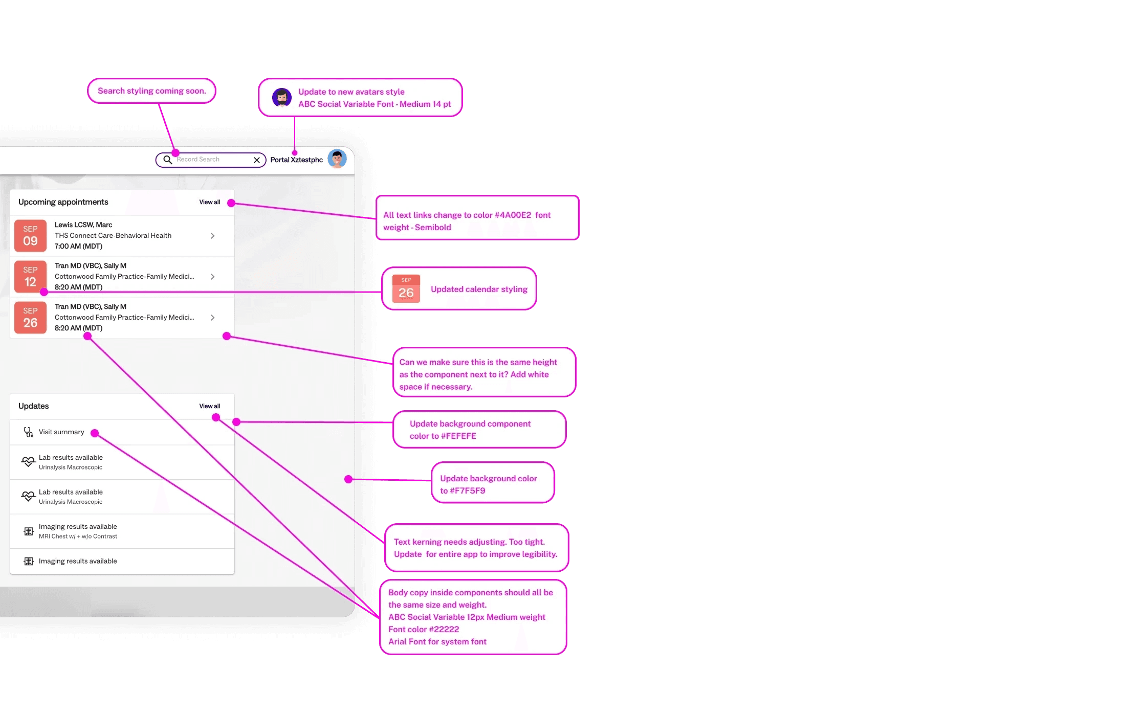
Labs & Appointment Widget
Updated styling, typography, colors, and spacing, with new icons and avatar styles
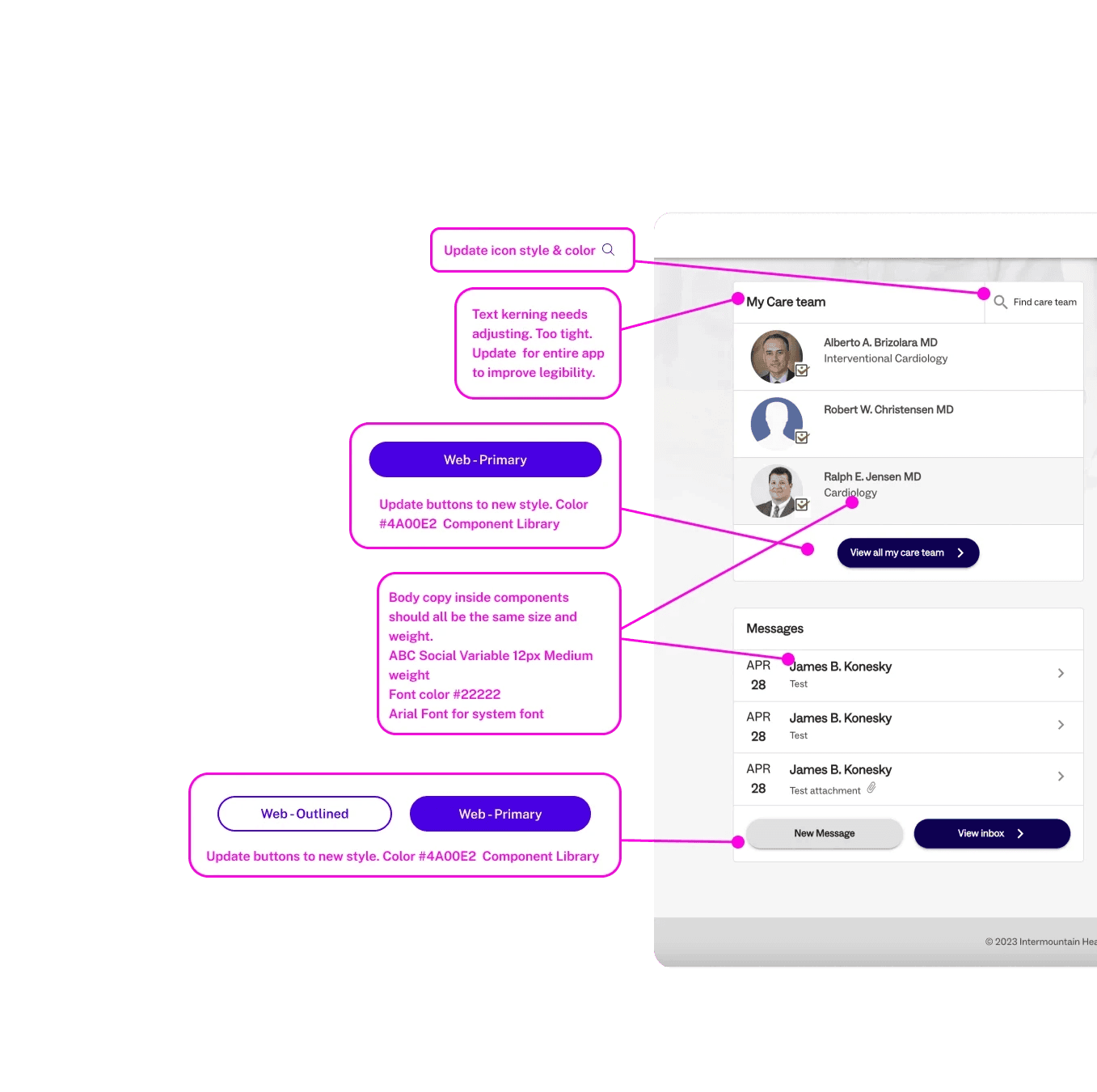
Provider & Messaging Widget
Enhanced with new buttons, typography, colors, and spacing
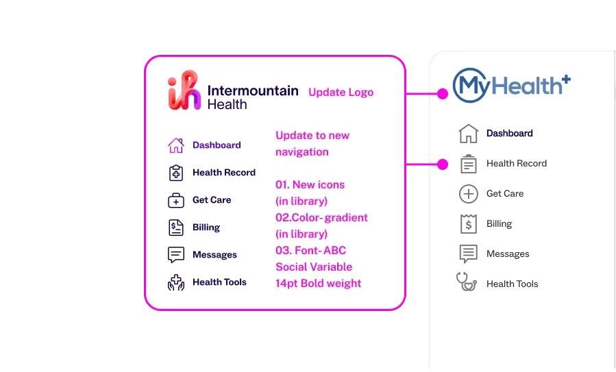
Navigation & Logo Update
Crafted icons with new style and color, a new logo, and simplified resources
Design system
Before
The brand agency provided us with a font package containing a serif and sans-serif font to implement. However, it posed a challenge due to its sizing, accessibility, and device adaptability.

After
We created and recommended a larger font, by 2 pts recommended and a higher contrast for typography color. In addition, the serif 'Rector' to not be utilized for responsive design and only for main static images.

Design system
Before
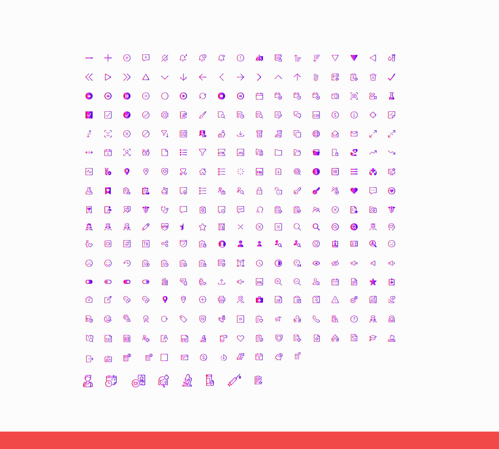
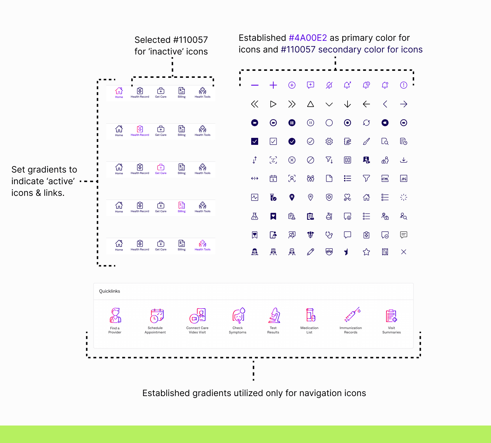
The main iconography was provided by the brand agency, along with use cases for gradient-heavy colors in the iconography. They also recommended using their third-party vendor for our icon system, raising concerns about device adaptability, compatibility, and potential impacts on user adoption.
After
We recommended using color gradients in iconography specifically for navigation icons to indicate 'active' status, rather than applying them to all icons in the app. Additionally, we suggested selecting Cobalt for informational icons and Dark Blue for indicating 'inactive' status.
Design system
Before
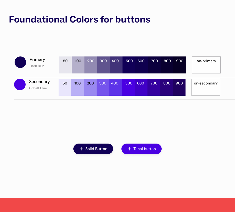
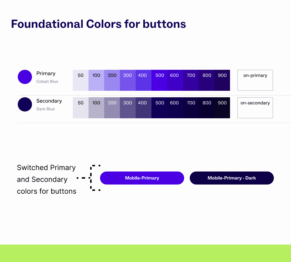
As previously mentioned, the color palette posed a challenge in meeting accessibility standards; the close similarity between the primary color and the primary button color compromised clarity and could hinder users' ability to identify key interactive components.
After
We recommended a higher contrast for typography color and switched the use cases of primary and secondary colors for main button components to address color overload, enhancing button visibility and ultimately increasing user engagement.
Design system
Before
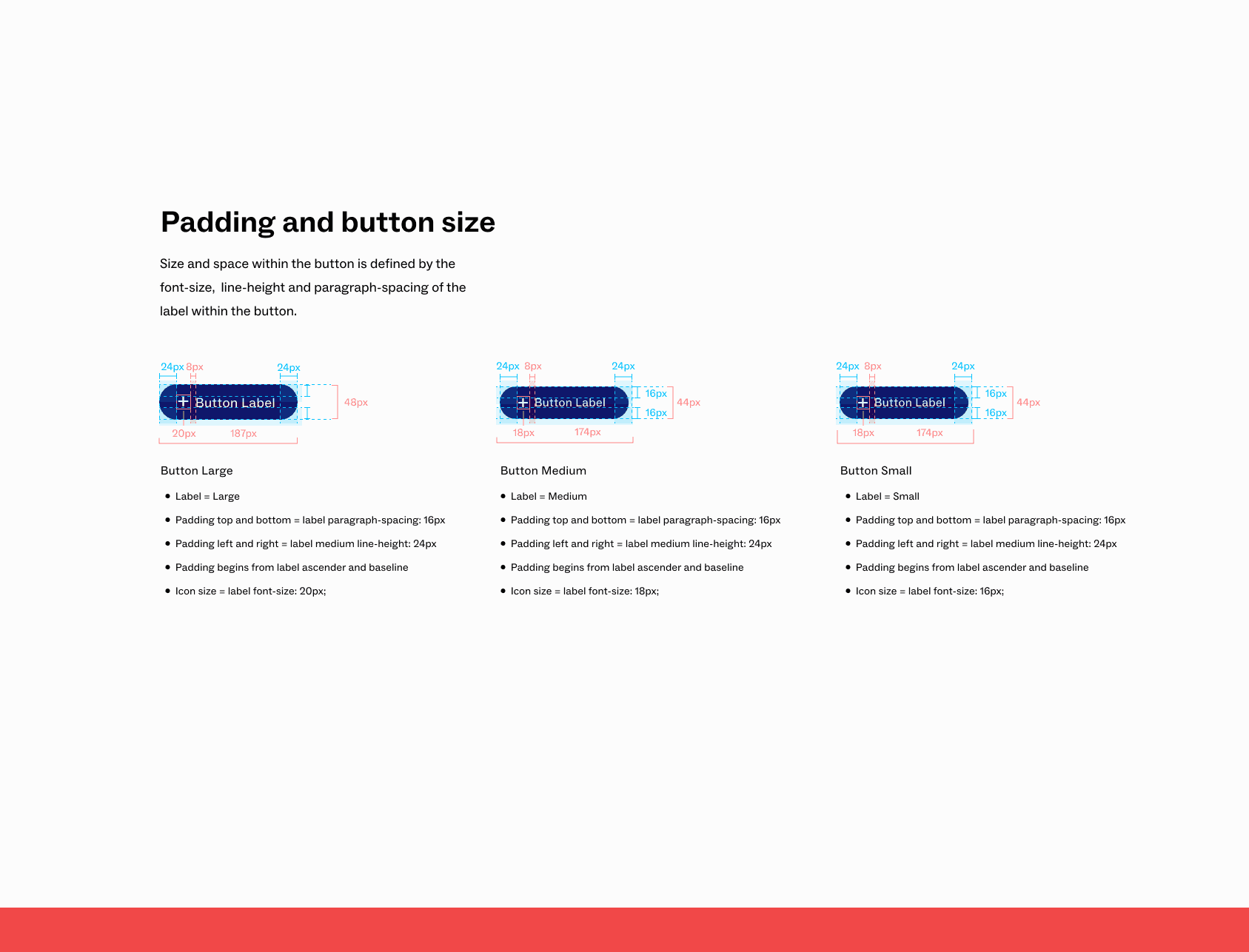
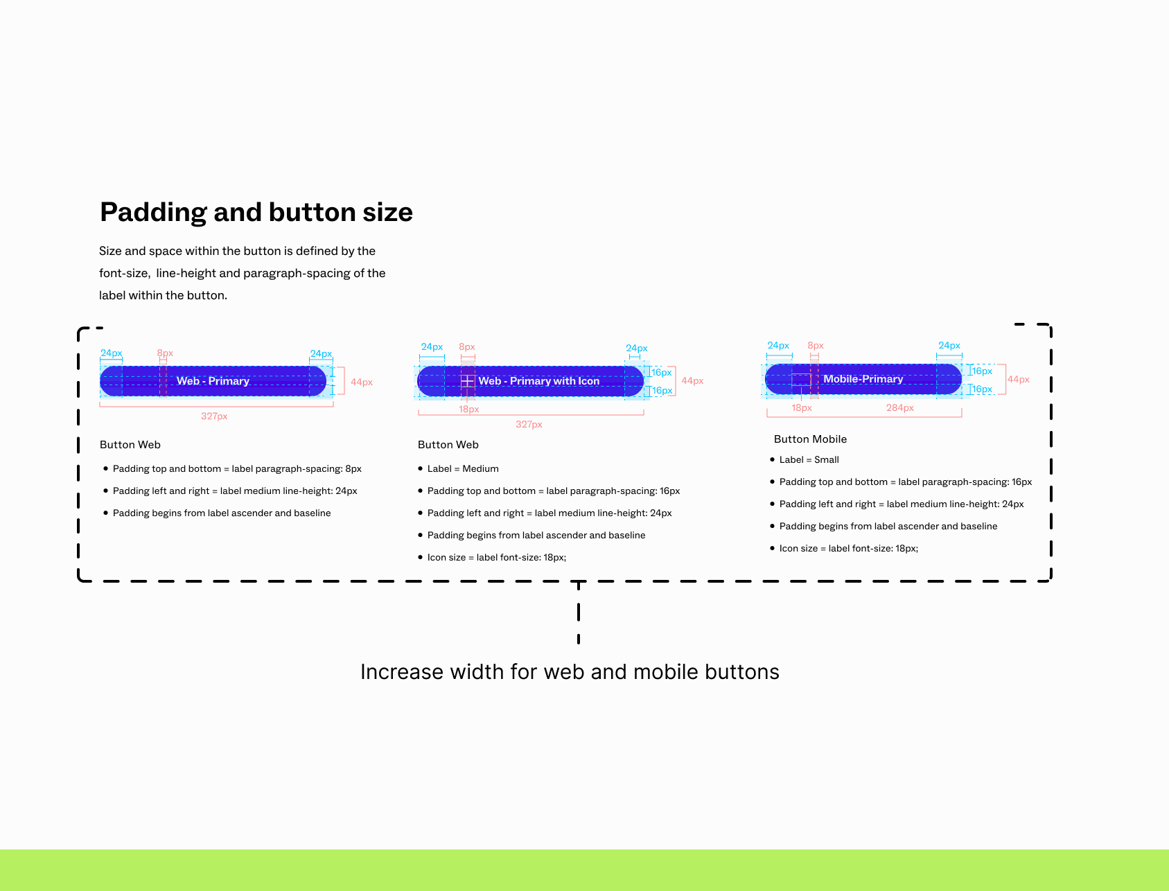
Our button components were provided by the branding team. However, as previously described, the sizing was very small for mobile screens and brought concerns for visibility and touch responsiveness.
After
We optimized responsiveness by increasing width, while creating distinct components for web and mobile to enhance visibility, touch responsiveness, clickability and usability.
Design system
Before
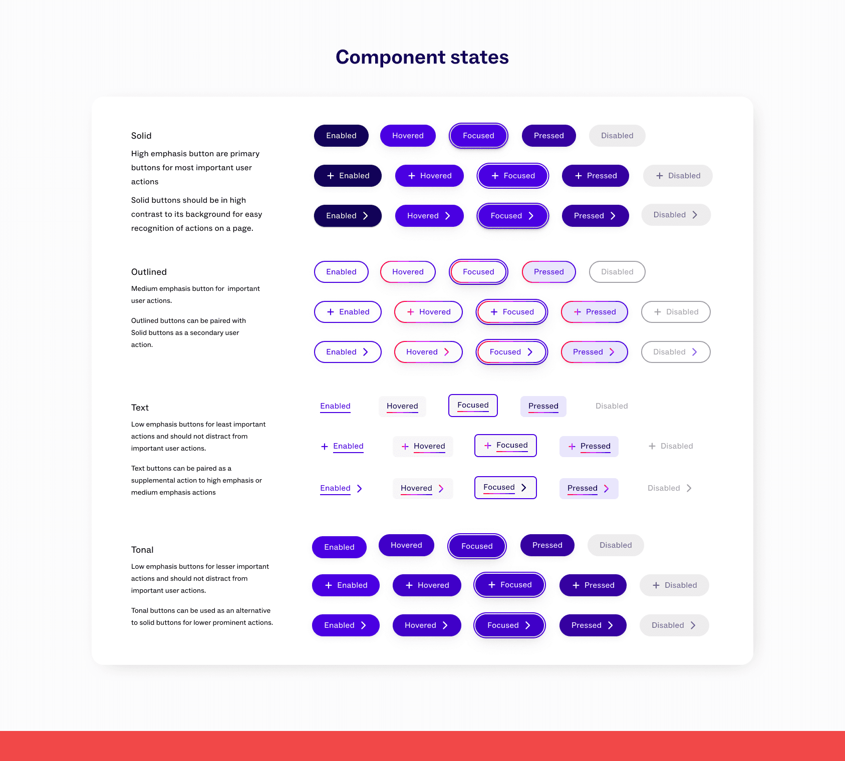
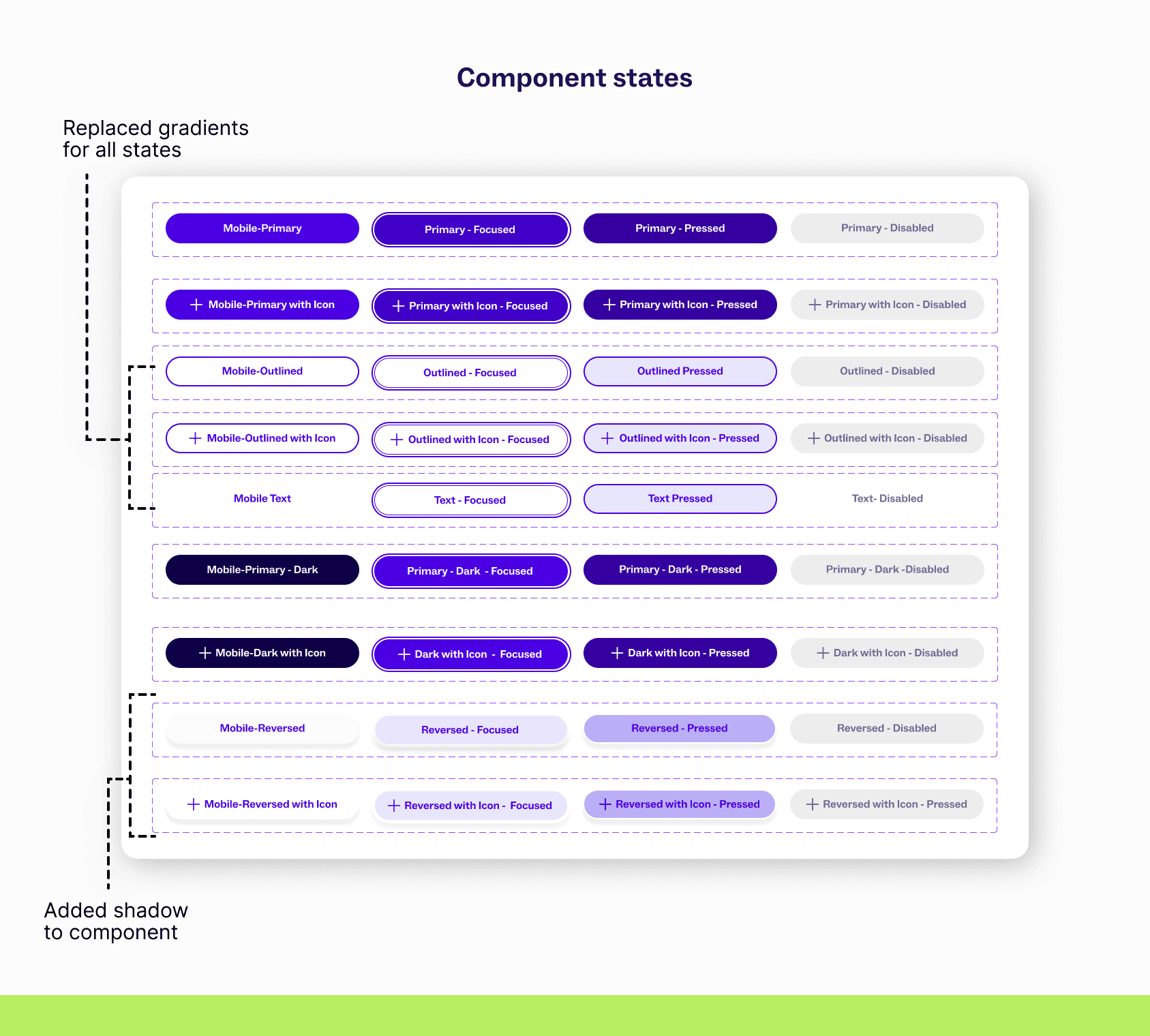
Our button components were provided by the branding team. However, as previously described, the colors were changed not only in their main state but also in other states. We created and recommended use cases for text buttons and hover states for all buttons.
After
We removed gradients from all component states, opting for solid backgrounds or double outlines to signify state changes. Text links will be utilized within the body and paired with solid color buttons when positioned outside of paragraphs. Additionally, we introduced a new component that features a refined drop shadow.
The challenge with the framework was due to naming conventions, which we collaborated with our dev team to update the code library, standardized terminology, and improve documentation clarity.
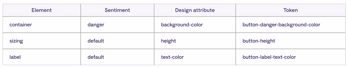
Brief example of tokens as the framework is still evolving
500k+
Users through Intermountain Health Apps.
2 mo
launched our brand release within 2 months

Reflection
Documentation was stability in chaos
Documentation was an anchor in ensuring consistency in designs, fixing bugs and reviewing finals as we moved at lightening speed.
Collaboration is key, not a cliché
As often as we preached, this tested our ability to dynamically collaborate as a team in our hub, across departments and the entire organization. It truly was all hands on deck and amazing to see the synchronization.
Limitation breeds creativity
With limited time, we were able to push ourselves to be more creative in our solutions. Rather than doubting, we prioritized rapid brainstorming that led to unexpected solutions.