Utah Open Lands
A web app for a non-profit dedicated to protecting Utah's lands threatened by development for public use.
In the last 20 years, Utah has become populous increasing the need for better outreach and visibility initiatives from Utah Open Lands to reach the public about their mission and aid in saving land. I worked alongside another designer, Megan, to create a site that is accessible across platforms to all users that will provide their audiences to learn, contribute, and donate in saving Utah's Open Lands.
Challenge
Utah Open Lands faces challenges in reaching a wider audience due to limited visibility and accessibility of its digital resources, hindering their ability to connect with the community and communicate their mission effectively.
Solution
We redesigned the Utah Open Lands website to enhance outreach, raise awareness of conservation initiatives, and foster community support, incorporating responsive design, improved accessibility, and streamlined content for an inclusive user experience.
Timeline
May 2021 - June 2021
ROLE
UX Designer & UX Researcher
Team
2 UX Designers
tools
Adobe XD and Photoshop, Zoom, Google Forms, HotJar Analytics
Research
Competitive Analysis
We began our investigation by analyzing 4 direct competitors in the land trust industry within Utah (Bureau of Land Management, Utah State Office of Parks & Rec, Summit Land Conservancy, and Virgin River Land Trust).
Insights
01
Summit Land and Bureau of Land Management enables users to make a donation across all types of devices to be involved as a call to action.
02
The information architecture in most of the applications, are the ones most users felt were intuitive and easily navigated. The users can see all components and listings in alphabetical order or call to action banners.
03
Summit Land Conservancy provides users the ability to preview their following goals and previous accomplishments which conveys engagement of community to users and new audiences, Summit Land Conservancy serves a smaller area of Utah than Utah Lands.
Research
Subject matter experts' interviews
We also conducted 3 subject matter expert interviews with Utah Open Lands employees to learn about the non-profit business and conservation goals. These interviews enabled us to determine the scope of the project and better understand the opportunity for engaging a broad range of audiences and providing a solution.
Interview Themes
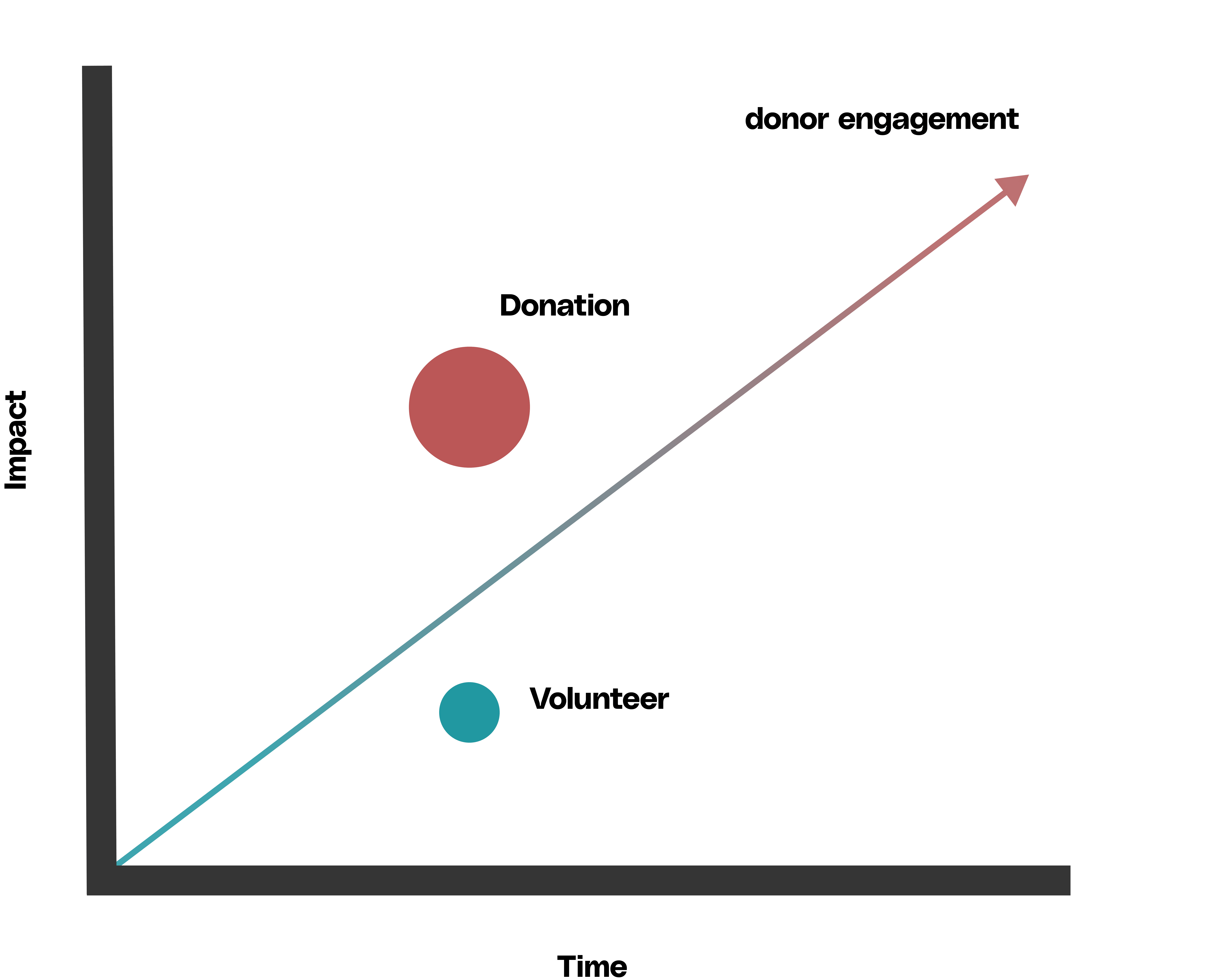
Donations
While both donations and conservation efforts are important, it was emphasized that donations are crucial as they have a higher significance in creating an immediate impact.
Volunteers
Voluntary efforts to protect lands have only a limited ability to stop the pressure of development on historically important habitats but would be a secondary need.
Donor Engagement
Asking or receiving donations provide immediate protection than expending resources to restore developed land than unaffected land. However, it is harder to request or inform users about how donations are used and create impact.
Research
User interviews
According to Utah Open Lands employees' suggestions, we interviewed 5 Utah residents to collect qualitative information about the current users and new audiences experiences to gauge whether current and new users had a need that might be met with a personalized donation feature.
Research
key insights from User interviews
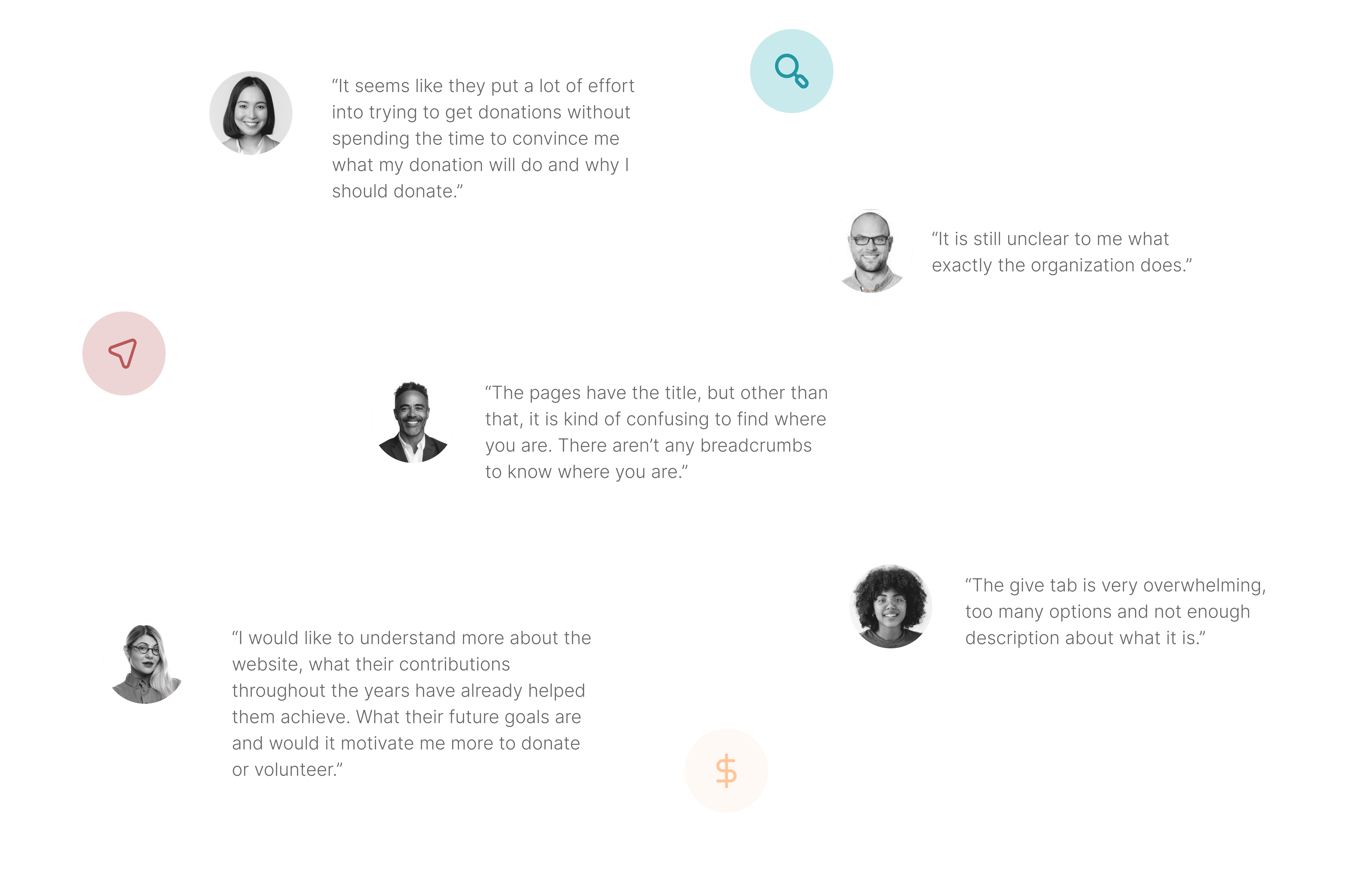
Confusion is disillusion
We learned that users were confused about who Utah Open Lands is and what they do from their website.
Persuasion has impact
Users felt that Utah Open Lands does not provide enough convincing stories or data to persuade them to donate.
'How' matters as much as 'Why'
We discovered that it is important for users to have details on how their donations and volunteer efforts are directly impacting the mission of Utah Open Lands
Guidance supports experience
We also learned that users tended to feel lost on the site and navigating the site, which made them less likely to make further donations or participate in volunteer efforts.
Semantics matters
Users who viewed the “give” button on Utah Open Lands' website were overwhelmed by the assumption that they would donate which led them to state there was a discrepancy between actual donations and the amount of money raised compared to other websites.
Genuine connection over generic
We also discovered that it is important for users to see personalization features to create a personal relationship between them so they could feel more connected and may be more likely to make donations as well.
Our North star Principles
Responsiveness
Create responsive website for all devices including mobile
Clear Call to Action
Highlight donation button and FAQ as these are the top inquiries received
Actionable Interactions
Showcase current projects to get signatures, volunteers and/or donations
Constraints
Limited time
Our work was under contract for a month in order to research and design so we had to work quickly between two designers.
Wireframing & Prototyping
Information Architecture
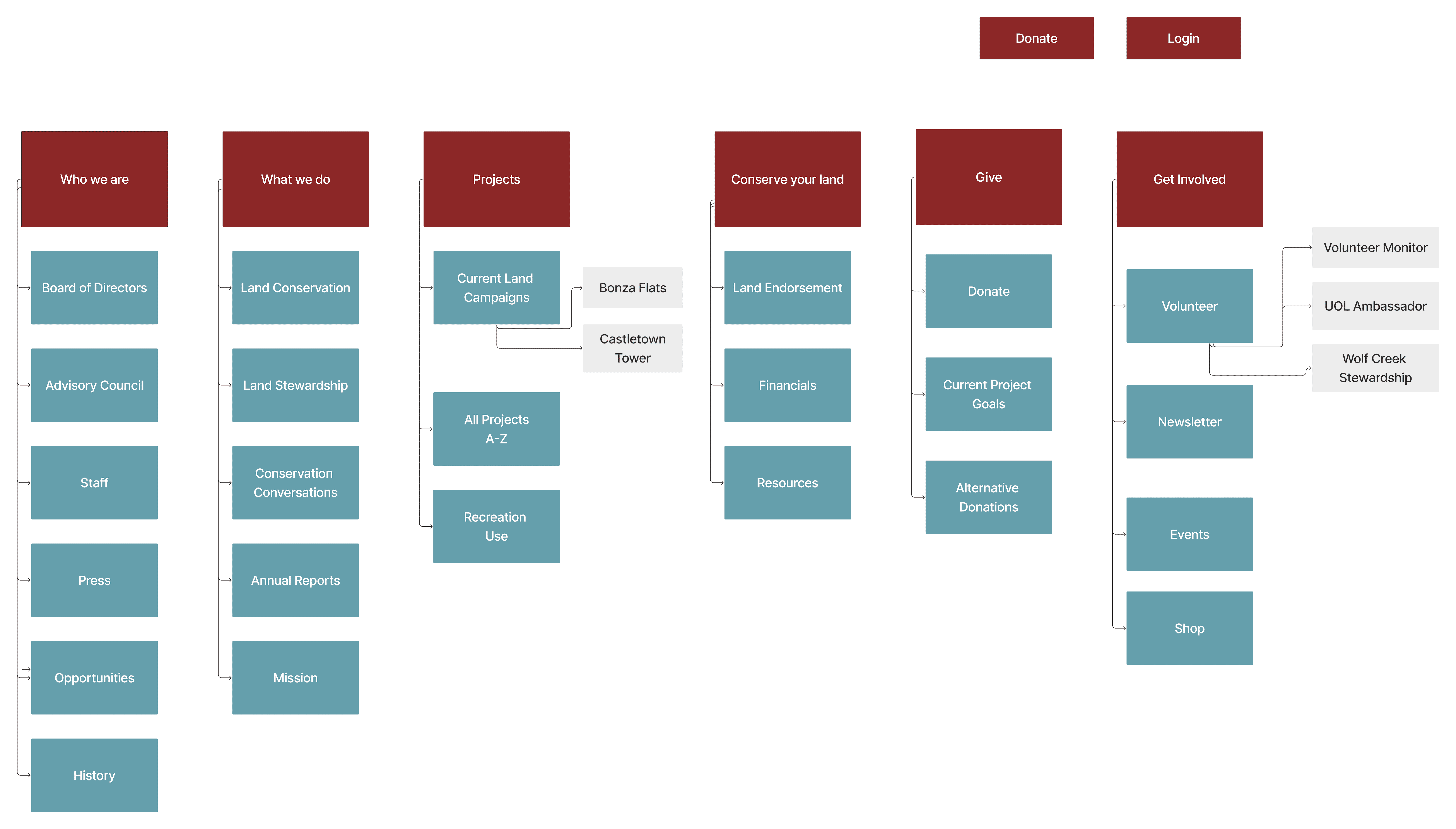
To help us identify current gaps in the user experience, we conducted a card sorting session to aid in creating a site map. Through this exercise, we identified new task flows for navigating the site for new and returning user for our main solution. We then created a user flow and user journey to help us determine gaps in the donating experience.
Design validation
Usability testing
We created a mid-fidelity prototype and moved on to evaluate our prototype. We recruited a total of 5 users from Utah and conducted a moderated usability test via Zoom and each session lasting around 20 minutes.
User Efficiency
Test user efficiency with new internal consistent system and site architecture
Discoverability
Test discoverability of newly designed components such as “donate” and “goals”
Usability
Test discoverability and usability of new interaction flow
Learn & Observe
Learn about users behavior around of when and where they interact with donate page and get involved
ux/ui iMPROVEMENTS
iterations
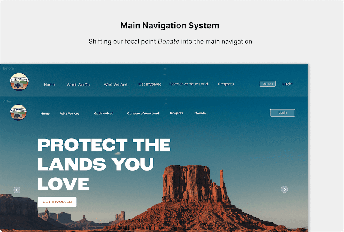
Move 'Donate' into the main nav
Our initial bias was having the “Donate” button next to the “Login” button as it would highlight this feature. However, some users were looking through the main navigation system. This made us reconsider the triggers for the Donate feature.
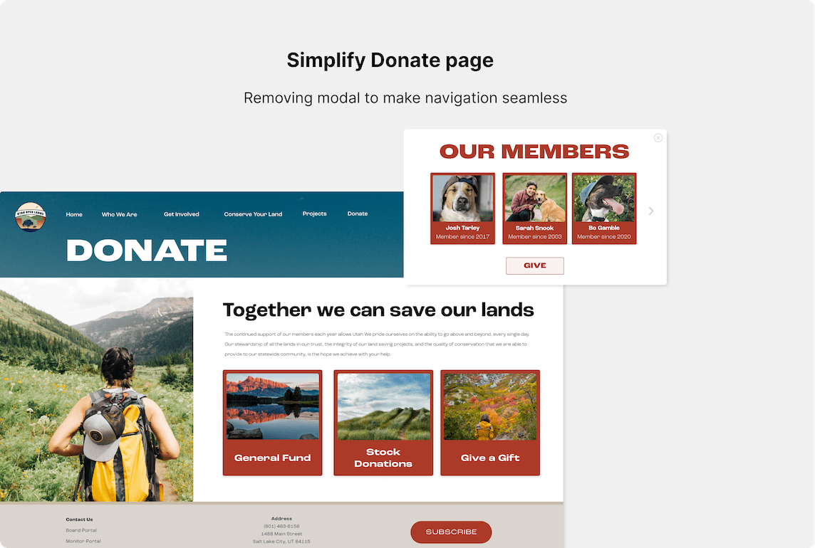
Remove modal from donate page
In our first iteration, we built a modal on the donate page to promote donation options. However, through evaluation, we found that users were overwhelmed by this because it is similar to the “give” wording which they would not utilize this feature. We decided to remove the pop-up feature so that users don’t lose interest in the interaction and experience with UOL.
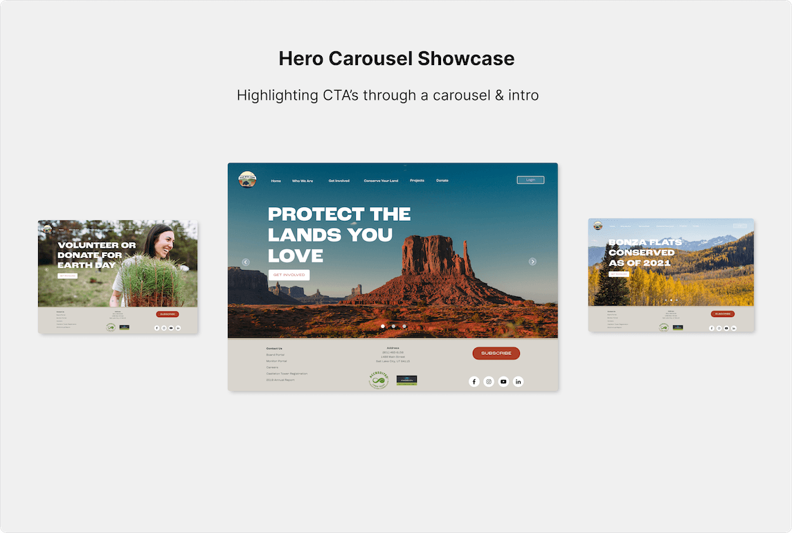
Showcase 'Donate' & 'Volunteer' through carousel
We experimented with creating a carousel of donation, goals, and volunteering in order to engage our users visually and through actionable CTA'S. We found that users felt this was a nice feature to see easily see how and what Utah Open Lands does and engage to explore the website.
Reflection
Outcome
The result is a more accessible, flexible and useful website to support Utah Open Lands’ growing audience while supporting its mission of protecting land in the state. However, there are considerations to take into account in the future. An example would be redesigning the Login Portal and how the CMS connected to account information changes the experience of Utah Open Lands based on the CMS UX and UI.
Utah Open Lands gave us positive feedback on our redesign and would be more likely to have a developer and future team implement our design and create a smooth transition between the design and CMS.

